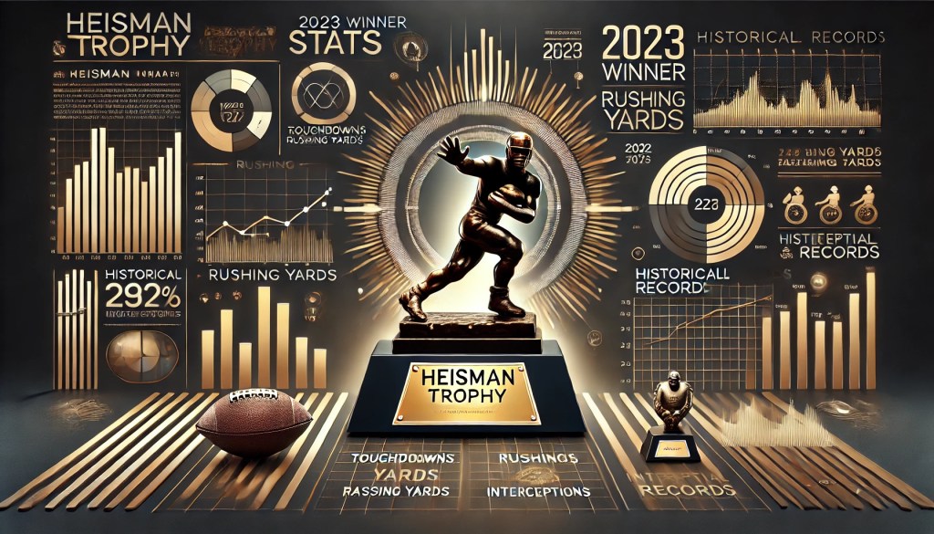
In the fast-paced world of college football, The Heisman Trophy race is as much about narratives as it is about stats. For fans, analysts, and players alike, keeping up with the ever-changing odds can be challenging. This is where infographics can come in handy: a tool that simplifies complex data into a digestible visual piece. This week, let’s look at organizations such as the one I explored, Sports Betting Dime, and how they use an infographic to communicate trends in the Heisman race and why these visuals are a strategic win for fan engagement.
The Power of Infographics in Sports
Infographics are more than just pretty visuals; they bridge data and comprehension. In the context of the Heisman trophy race, they condense performance stats, betting odds, and historical trends in graphics that are easy to digest. For instance, Sports Betting Dime’s Heisman Trophy odds infographic updates in real-time every 15-60 minutes to adjust the Heisman odds based on the top-rated college football betting apps, including FanDuel, DraftKings & Bet365. They showcase how performances like Travis Hunter’s two-way dominance or Ashton Jeanty’s consistent rushing yards impact their odds.
By presenting numbers visually, these graphics cater to both casual fans looking for quick insight and hardcore analysts who like the finer details. This dual appeal makes infographics an invaluable asset in strategic communication.
Why Organizations Use Infographics
Clarity and simplicity: Words can explain, but visuals simplify. For a complex topic like fluctuating Heisman odds, a well-designed infographic breaks down the numbers into patterns and trends at a glance.
Engagement: Visual content is more likely to be shared on social media, increasing reach and driving traffic to a site. Infographics also allow fans to quickly spot their favorite players or teams, keeping them emotionally invested.
Credibility: Dynamic graphics lend an air of professionalism and reliability. Increasing the reach and driving traffic to a site. Infographics also allow fans to quickly spot their favorite players or teams, keeping them emotionally invested.
Example: Heisman Odds Over Time
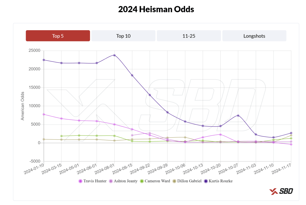
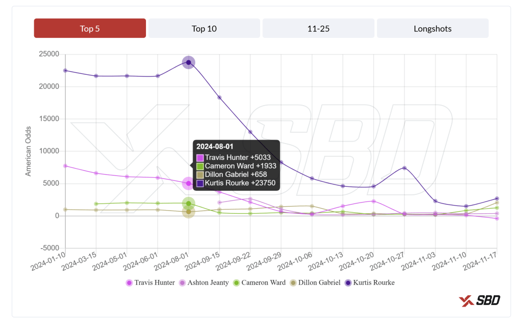
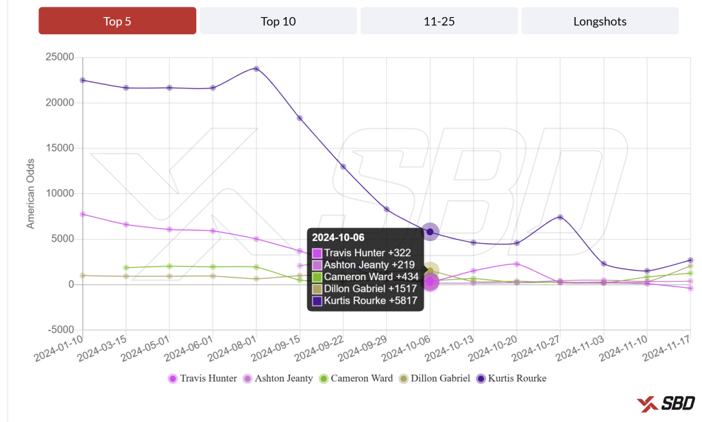
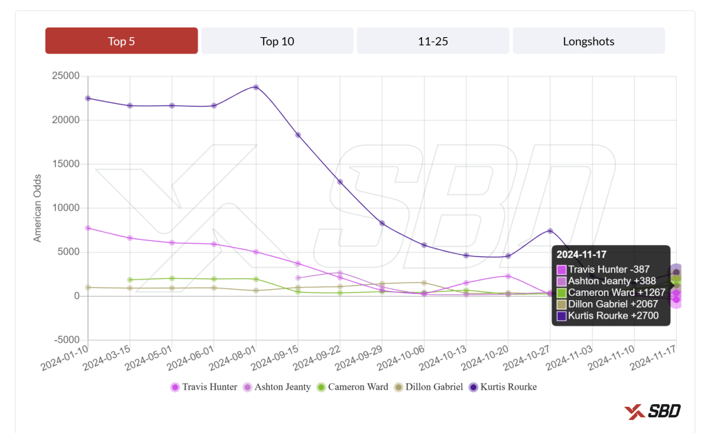
Let’s take a closer look at the Sports Betting Dime Infographic. It tells the story of the 2024 Heisman race and it aligns perfectly with my past blogs and how analysts have ranked the players. We will look at the trends for the top five contenders as of now throughout the season.
August: Dillon Gabriel’s offseason hype propelled him to be the early favorite status
October: Ashton Jeanty surges with record-breaking performances, briefly holding the top spot
November: As of today, Travis Hunter’s versatility has helped him overtake Jeanty, and Cam Ward’s odds have slipped after inconsistent showings.
Data Visualization, like the Heisman odds infographic, demonstrates the power of visuals in simplifying complex information. By tracking player performance and shifting odds, infographics enhance understanding spark conversations, and keep fans engaged. As the 2024 Heisman race unfolds, tools like these ensure that fans stay informed and invested in the Journey.
Check out the latest Heisman odds and follow me for more insights on the race for college football’s most prestigious award.

Leave a comment